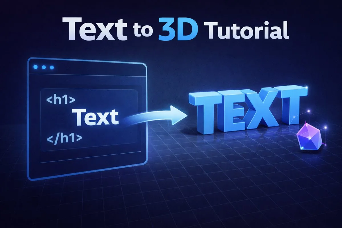
Traditionally, creating 3D text meant opening heavy software, setting up a scene, lighting it, and waiting for a render. Vextrude changes that by running a real-time 3D engine right in your browser.
Whether you need a sleek header for a landing page, a 3D printable nametag, or a GLB asset for an AR experience, the process is streamlined to just a few clicks.
Step 1: Choosing Your Font & Content
Typography is the foundation. In the Content panel (left sidebar), you can type any text you want.
- Standard Fonts: We provide reliable options like Helvetiker, Droid Sans, and Optimer. These are optimized for 3D extrusion.
- Custom Fonts: Want to use your brand's font? Click "Upload File" to load any .TTF or .OTF file from your computer.
Pro Tip: For 3D text, Bold or Black weights usually work best. Thin fonts can become fragile when extruded or 3D printed.
Step 2: Mastering Geometry Settings
The "Geometry" panel (right sidebar) is where the magic happens. Here are the key settings:
- Extrusion Depth: How "thick" your text is. High values (e.g., 10+) create blocky, monumental text. Low values (e.g., 0.5) create flat, card-like text.
- Bevel Thickness: This adds a chamfered edge to your letters. It catches the light and makes the text look realistic rather than like a simple cutout.
- Bevel Size: Controls how wide the bevel spreads across the face of the letter.
Step 3: Materials & Lighting
A 3D model is nothing without light. Use the Material Presets at the top of the viewport to instantly change the vibe:
- Standard: Matte finish, great for clean, modern UI designs.
- Metal: Highly reflective. Use the "Roughness" slider (if available) or rely on the environment map to create chrome or gold effects.
- Neon: Emits light. Perfect for cyberpunk or nightlife aesthetics. Turn on the "Bloom" toggle in View Options to make it glow.
Don't forget to rotate the light source using the Lighting sliders to find the perfect angle that highlights your bevels.
Step 4: Exporting for Your Needs
Once you're happy, it's time to export. Vextrude offers three formats:
GLB
Best for Web & AR. Contains colors and materials in one small file.
OBJ
Universal standard. Use this if you plan to edit the mesh in Blender.
STL
Geometry only. The standard format for 3D printing slicers.
Advanced Tips & Tricks
Once you have mastered the four core steps, these techniques will take your 3D typography to the next level and help you produce assets that look genuinely professional.
Combining text objects for hierarchy
Need a bold headline in one style and a subtitle in another? Generate each word or phrase as a separate export and combine them in Blender, Figma, or your target game engine. Using a larger extrusion depth and bigger bevel for the headline versus a shallower, sleeker treatment for the subtitle creates a clear visual hierarchy that feels intentional rather than accidental.
Matching real-world scale for 3D printing
When printing your text, set the Extrusion Depth to reflect physical millimeters. A value of 5 in Vextrude maps to approximately 5 mm in most slicer imports after a standard unit calibration. For desk ornaments and plaques, a depth of 8–12 mm gives a satisfying solid feel. For wall-mounted letters, 20–30 mm creates dramatic depth without excessive material cost. Always verify the bounding box in your slicer after import — some slicers apply a default unit conversion that scales the model unexpectedly.
Using the Bloom effect for screenshots
Enable the Bloom toggle in the View Options panel before taking a viewport screenshot. Bloom adds a luminous glow around bright surfaces, making the Neon material look extraordinary with almost no extra effort. The effect renders in real-time and is captured in the screenshot, saving you post-processing work in Photoshop or Canva. This trick is especially effective for gaming and music brands where high-energy visuals are expected.
Custom fonts and licensing
When uploading a TTF or OTF file from your brand’s font library, check your license terms first. Most commercial fonts allow use in static images and 3D prints for personal or commercial projects, but embedding a font inside a web-delivered GLB file may technically require a separate web embedding license. Open License fonts such as Inter, Roboto, Raleway, and all Google Fonts are completely unrestricted for all use cases including web-delivered 3D assets.
Optimizing polygon count for web
The Curve Segments setting controls how many straight segments approximate each curved letter outline. At high values, circles and rounded letters look smooth but generate far more triangles than necessary. For web use, reduce this setting to the lowest value that still looks clean at your intended display size. Cutting Curve Segments from 24 to 8 can reduce GLB file size by 50% with no perceptible quality loss on a standard monitor.
Common Mistakes to Avoid
- Using a thin font weight: Extra-Light and Thin weights have very narrow strokes. When extruded, the bevel can consume the entire letter face, leaving barely any flat front surface. For strong 3D results, use Bold, Heavy, or Black weights. Preview at your intended extrusion depth before committing to a thin font.
- Setting bevel larger than extrusion depth: If your Bevel Thickness exceeds half the Extrusion Depth, the front and back bevels collide in the middle, producing inverted geometry and visible glitches. A safe rule: keep bevel thickness at no more than 25–30% of extrusion depth. For an extrusion of 4, keep bevel thickness at 1 or below.
- Exporting at maximum segment count for web: High segment counts produce smooth curves in the viewport but unnecessarily large GLB files that load slowly in the browser. For web use, reduce Curve Segments to 6–10 as a starting point and increase only if edges look visibly faceted at your display size.
- Forgetting to scale or center before export: The default camera view may look correct, but the actual model origin might be offset. Check that your text is centered at the world origin (especially if you plan to use auto-rotate in
<model-viewer>) so the rotation spins around the center of the text rather than an edge.
Frequently Asked Questions
Does Vextrude support all TTF fonts?
Vextrude supports most standard TTF and OTF fonts. Fonts with extremely complex glyphs, such as certain Arabic, Devanagari, or CJK character sets, may produce high polygon counts or triangulation errors. If a custom font causes issues, try a simpler font weight or reduce the Curve Segments setting to lower the complexity of each glyph outline.
Can I animate my 3D text after exporting?
Vextrude generates static geometry. For animations, export as GLB and import into Blender where you can add rotation, floating, scale-in, or reveal animations. The <model-viewer> web component provides built-in auto-rotate and interactive pan/zoom with no custom JavaScript required.
My text edges look jagged or pixelated. How do I fix it?
Jagged bevel edges mean the Bevel Segments value is too low. Increase Bevel Segments to add more geometry around the chamfered edge, which smooths the curve into a rounded profile. Be mindful that higher values increase the polygon count and GLB file size, so find the lowest value that still looks clean at your target display size.
Is there a character limit for 3D text generation?
There is no hard character limit, but very long strings generate proportionally more geometry and can slow down viewport interaction on lower-end hardware. For best results, generate long text in shorter segments (one word or phrase per session) and position them relative to each other in your target environment such as Blender or Three.js.
What is the difference between Extrusion Depth and Bevel Thickness?
Extrusion Depth is the total thickness of the text from front face to back face. Bevel Thickness is how much the edge is chamfered (the diagonal face between the front surface and the side wall). Think of it like a book: Extrusion Depth is the spine width, and Bevel Thickness is how much the corners of the cover are rounded off.